Overview
About
Weekwise is an agency resource allocation tool that visualizes the time and resources project managers can allocate when planning projects.
My role
UX/UI Designer.
I joined a SaaS time-management platform after launch to help it scale. I redesigned core screens to reduce the time it takes to complete key tasks and shipped new features to grow the product — working within the existing design system.
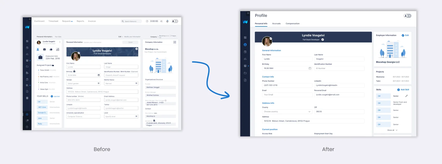
Profile UX enhancement
Problem
The previous profile showed a lot of information that wasn't needed, and the details that mattered weren't grouped together.
What I did
I cleaned it up and grouped the key profile details, based on feedback from platform users and the product owner — working within the existing design system.
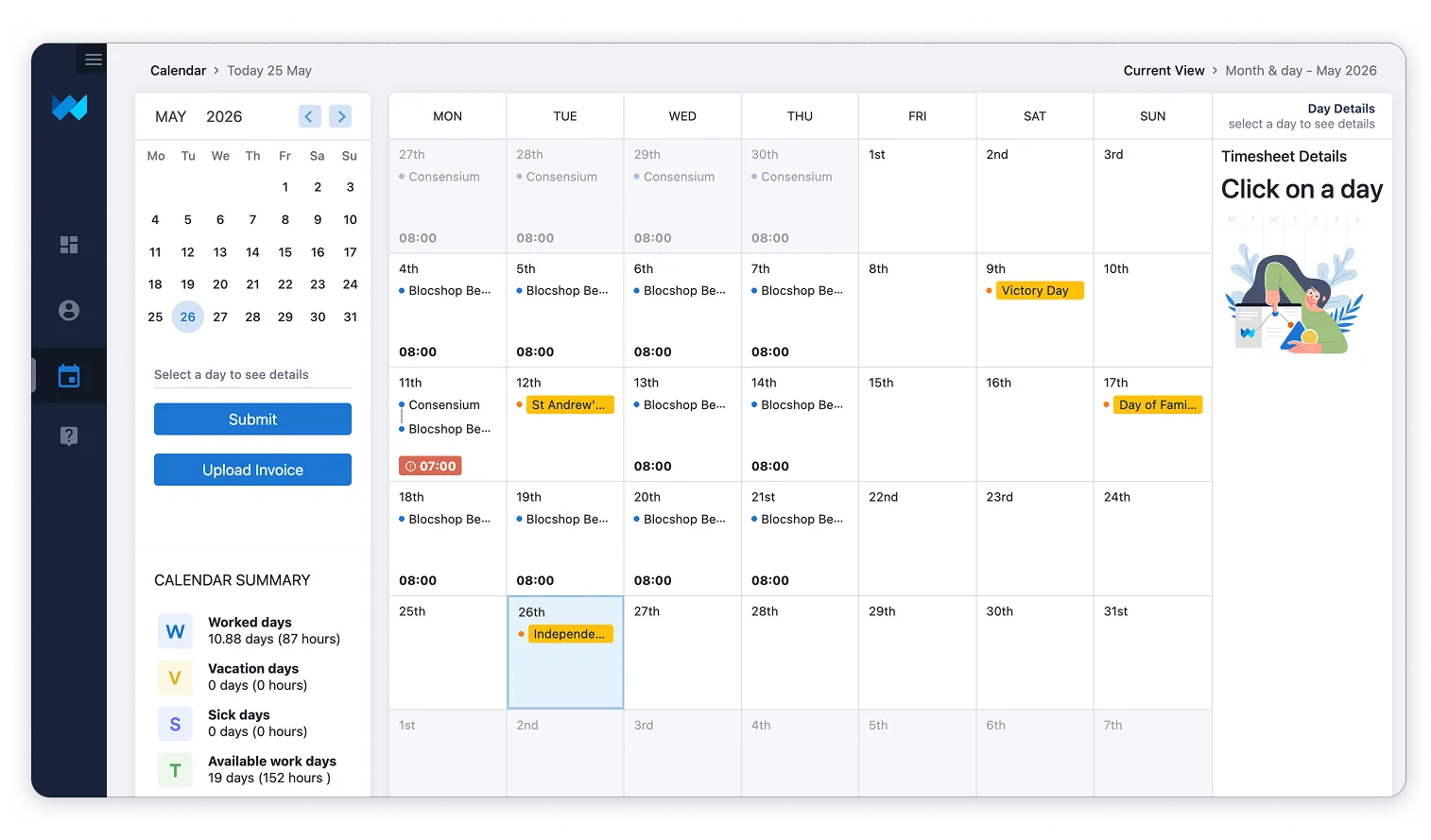
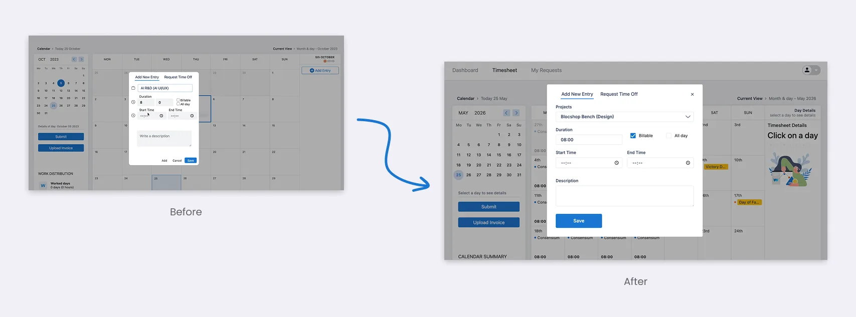
Timesheet & entry point
Problem
The timesheet was rigid and didn't scale well as the product grew.
What I did
I redesigned the timesheet — the flow for adding working hours or time off to the calendar — and defined a design standard for all pop-ups (overlays). I also made it responsive for mobile, which wasn't supported before.
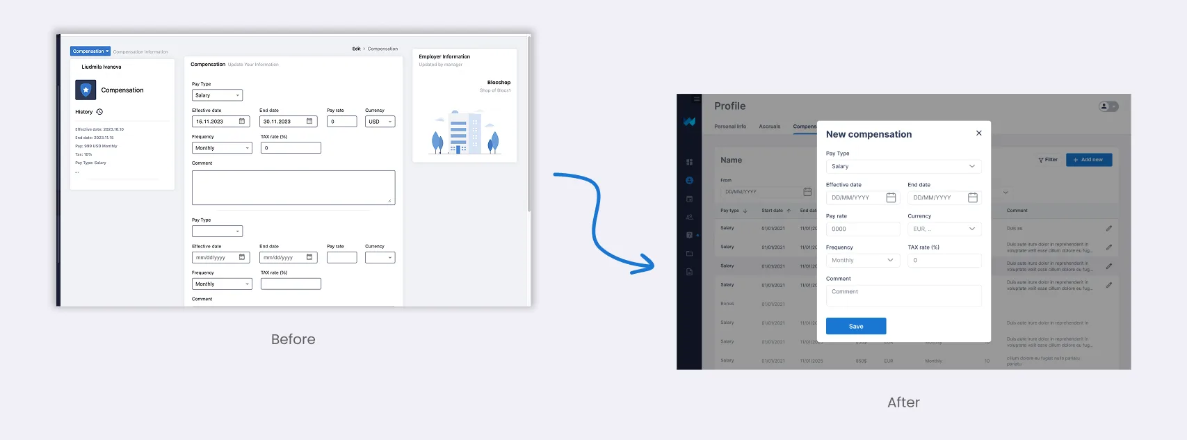
Compensation screen
Problem
Adding a new compensation record meant leaving the list and moving to a separate page — the navigation got in the way.
What I did
I designed the admin page so a new record is added in an overlay on top of the list, without navigating away. I also simplified the add-record flow and updated the table design.
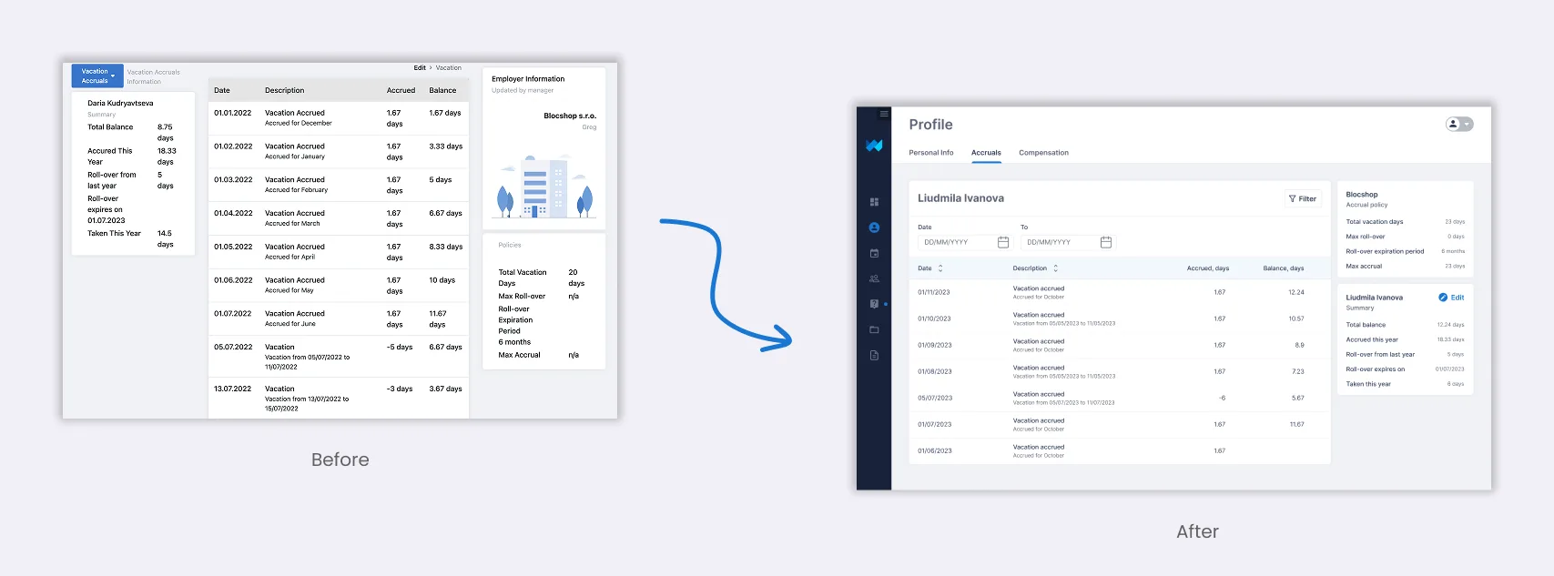
Accruals page
Problem
The existing accruals table had no filter, search, or sorting, which made it hard to work with as the data grew.
What I did
I designed both the admin and user views, built on the new shared table component with filter, search, and sorting.
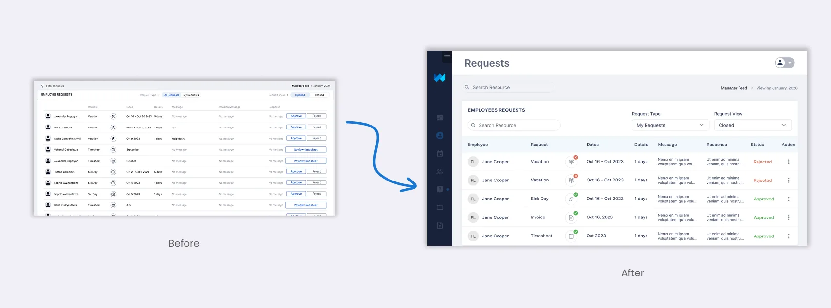
Requests page
Problem
The requests page had the same table problem — no filter, sorting, or search — so it didn't scale.
What I did
I moved it to the new shared table component, with filter, sorting, and search, and reworked the columns to show the most relevant information.
Outcome
Weekwise was a post-launch scaling project, so the work wasn't one big redesign — it was steadily improving the screens people relied on every day and giving the product a foundation to grow on. Standardizing the overlays and moving to a shared table component made the experience more consistent and far easier to extend.
What I shipped
- Regrouped the user profile around what matters
- Redesigned the timesheet flow + mobile support
- Standardized overlays across the product
- Compensation admin page + Accruals admin & user views
- New shared table (filter, search, sorting) on Accruals & Requests