Overview
About
Talkn is an AI-assisted e-commerce platform that helps users discover products through a conversational interface.
Many users don't know exactly what they want to buy, making traditional search and filtering ineffective. Talkn addresses this by guiding users through product discovery using an AI chat assistant, helping them clarify preferences and find relevant products in a more intuitive and engaging way.
My role
I worked on the UX and UI of this project from August 2023 to November 2023.
My responsibilities included designing user flows, creating the UI, developing the branding, and collaborating closely with developers.
The team consisted of 1 designer (me), 1 frontend developer, 2 backend developers, 1 marketing specialist, 1 sales representative, and the product owner.
Early version of the product
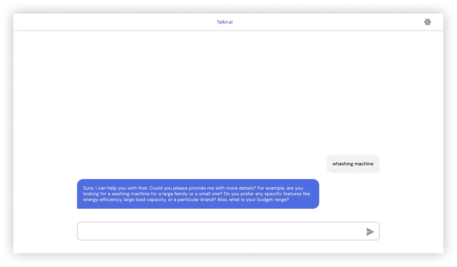
When I joined the team, the product was a basic chat feature that returned links to products.
Understanding the problem
Problem statement
Users often struggle to interact with e-commerce platforms when they don't have a clear idea of what they want to buy. Most online shopping experiences rely heavily on search and filtering, which require users to know exactly what they are looking for.
AI-powered chat assistants offer flexibility, but often lack structure and guidance, making product discovery feel unclear and overwhelming.
Design challenge
Design a guided product discovery experience for users without a clear intent.
The goal was to use AI chat to help users explore options, refine preferences, and make decisions, while keeping the interaction clear and easy to follow.
Discovery
Identifying and prioritizing users
To better understand the problem space, we focused on users who struggle with product discovery when they don't have a clear intent.
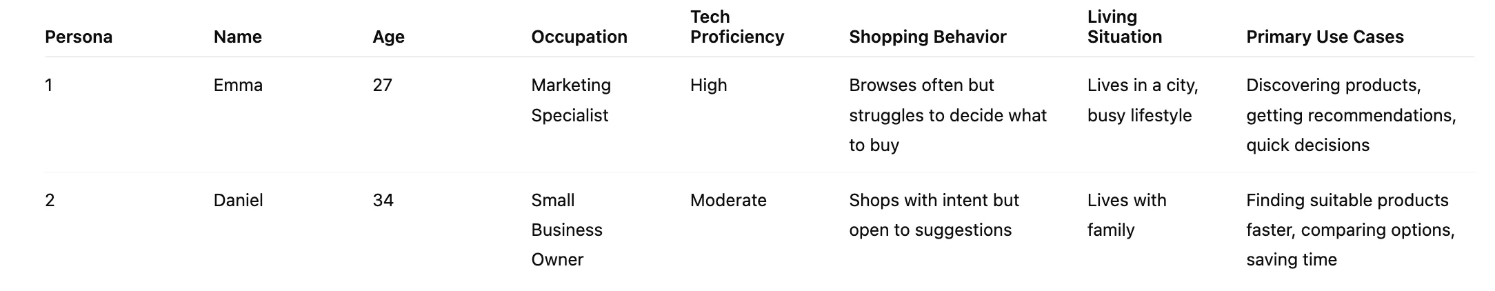
Two key personas were identified:
- Emma — unsure what to buy, looking for inspiration, guidance
- Daniel — has a general idea but needs help refining options
While both personas were important, the main focus was on Emma, as she represents the biggest gap in current shopping experiences.
User goal
Emma, 27
marketing specialist
“I want to quickly find something that fits my needs without feeling overwhelmed or unsure where to start.”
Customer journey map
To understand where users struggle, we mapped the journey of discovering a product without a clear intent.
The journey shows key moments where users feel uncertain, overwhelmed, or unable to move forward, especially at the beginning and during decision making.
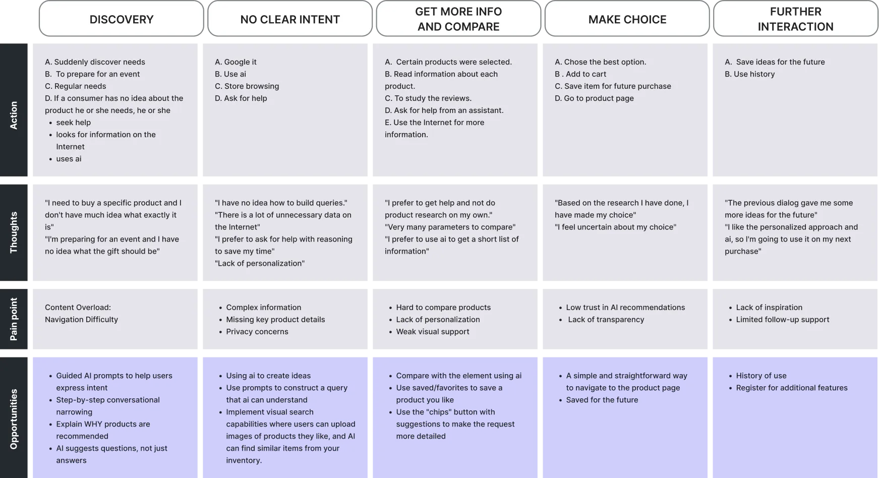
Key Insights
- Users need help defining what they want
- Too many options make decisions harder
- AI should guide, not just respond
- Transparency builds trust
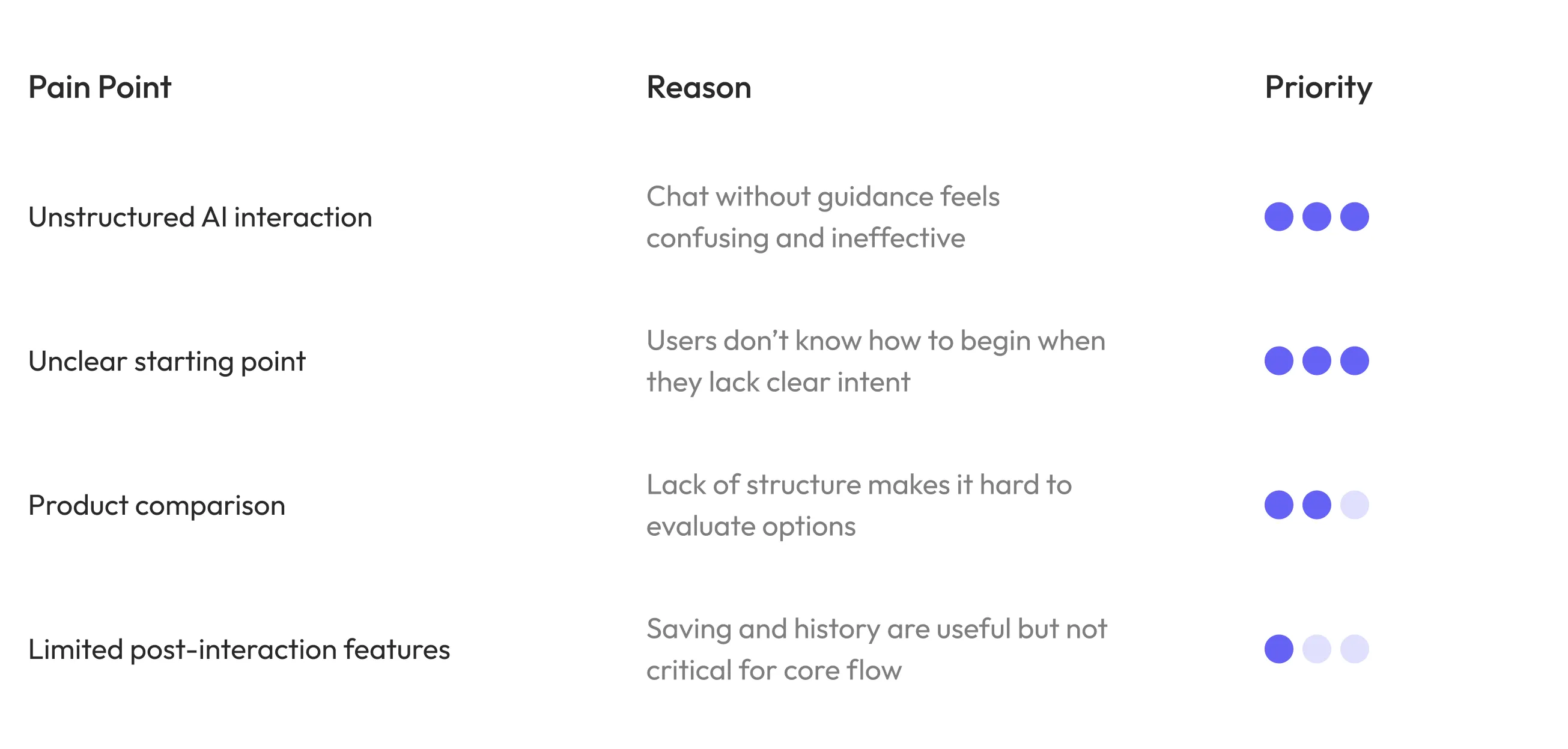
Pain point prioritization
Pain points were prioritized based on their impact on users and the effort required to address them.
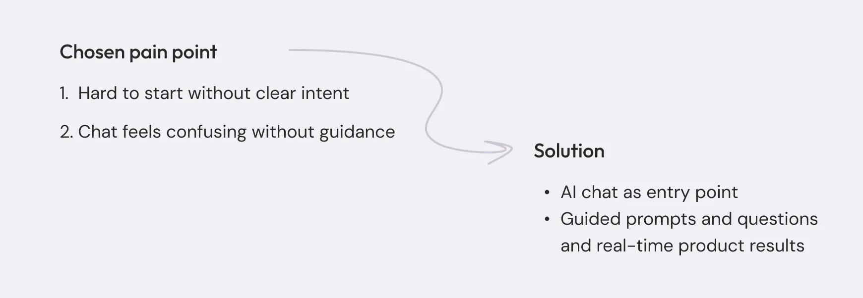
Pain point 1 – Exploring entry experience
Problem
Users don't always know what to type or how to start interacting with AI.
Competitor Research
To better understand this problem, I looked at how similar platforms solve it.
- Reviewed AI-assisted shopping experiences (e.g. Shopify, Shopwith AI)
- Analyzed how users interact with chat-based product discovery
Key insights
This helped identify a few key gaps in how users are supported.
- Chat lacks guidance
- AI is reactive
- Product discovery is not structured
These insights defined the direction for a more guided and structured experience.
Defining the direction
Based on these insights, I explored different approaches to understand what works best for guiding users through product discovery
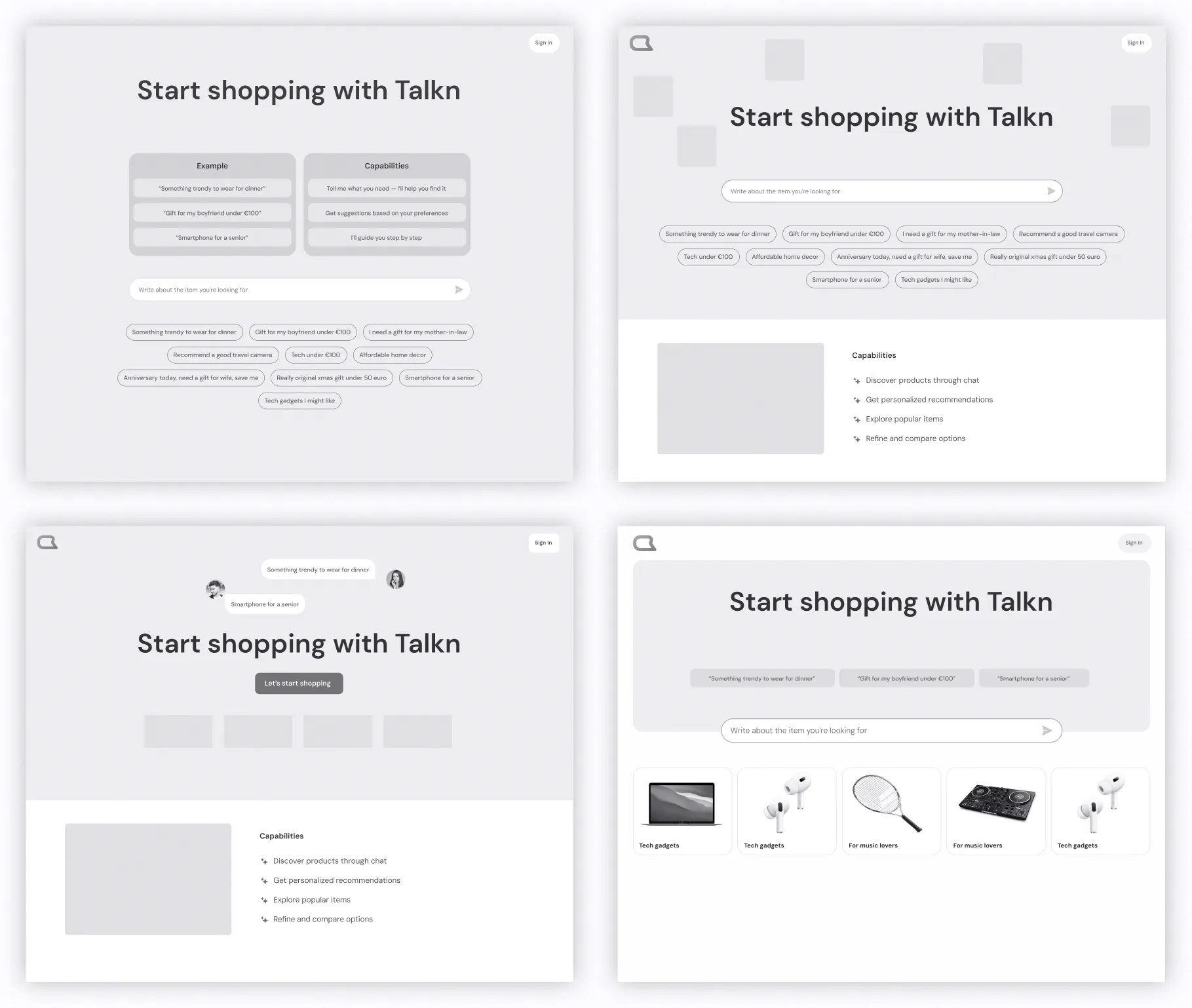
What worked
- Chat as the main interaction
- Clickable prompts
- Popular categories
Designing the experience
We combined the most effective elements into one entry experience to support different user behaviors.
The design focuses on helping users start easily, refine their needs through chat, and explore relevant products in a structured way.
Outcome
Users can go from "I don't know" to exploring in seconds.
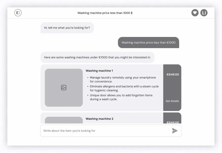
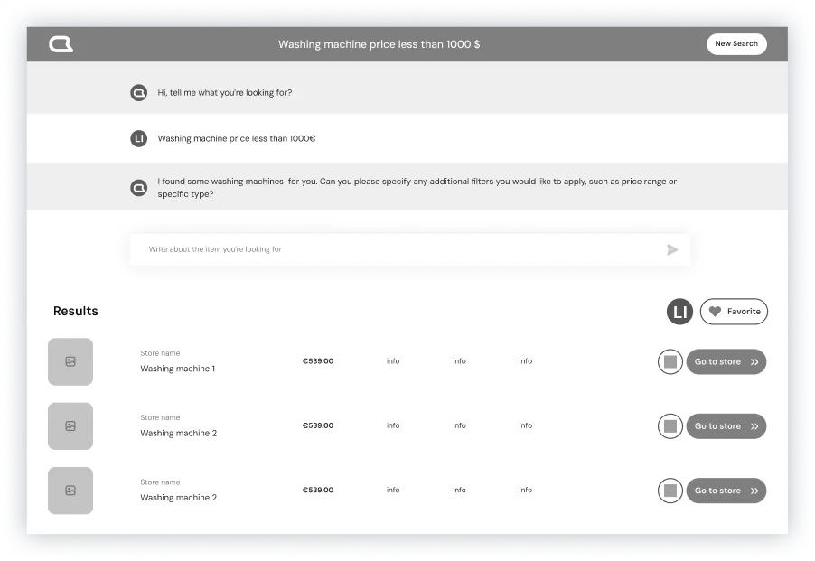
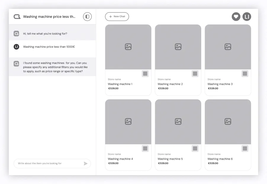
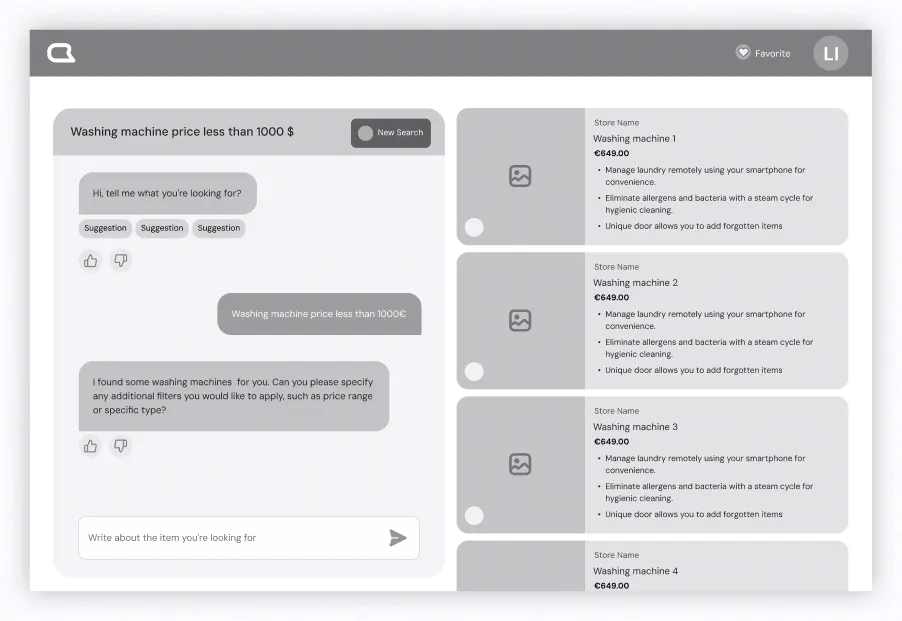
Pain point 2 – Unclear chat interaction
Understanding the Problem
Users felt confused when chat and product results appeared together.
It wasn't clear how chat worked or how it influenced the results, so many users ignored it and continued browsing as usual.
Competitor Research
To understand this better, I looked at how similar platforms integrate chat into product discovery.
What our competitors had
I noticed that suggestion chips help users continue the interaction, but chat is often treated as a secondary feature. Once users see product results, they tend to focus on browsing and forget about chat completely.
This showed a clear gap. Chat wasn't guiding the experience, it was just sitting next to it.
Key insights
- Chat is often ignored when products are visible
- Users don't understand how chat affects results
- Lack of structure makes interaction unclear
Defining the direction
Based on this, I focused on making the interaction more structured and easier to follow. The goal was to make chat feel like a core part of the experience, not something optional.
Cons: Hard to scan and compare
Cons: Weak connection to chat
Cons: Chat feels secondary
Cons: More complex layout
Testing
I explored different ways to combine chat and product results without overwhelming users. Through low-fidelity prototypes and testing with 5 users, it became clear that keeping both visible at the same time works best.
What worked
- Step-by-step questions guide the conversation
- Results update in real time
- Chat and products stay visible together
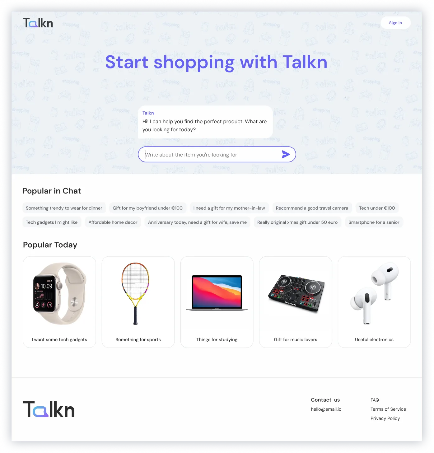
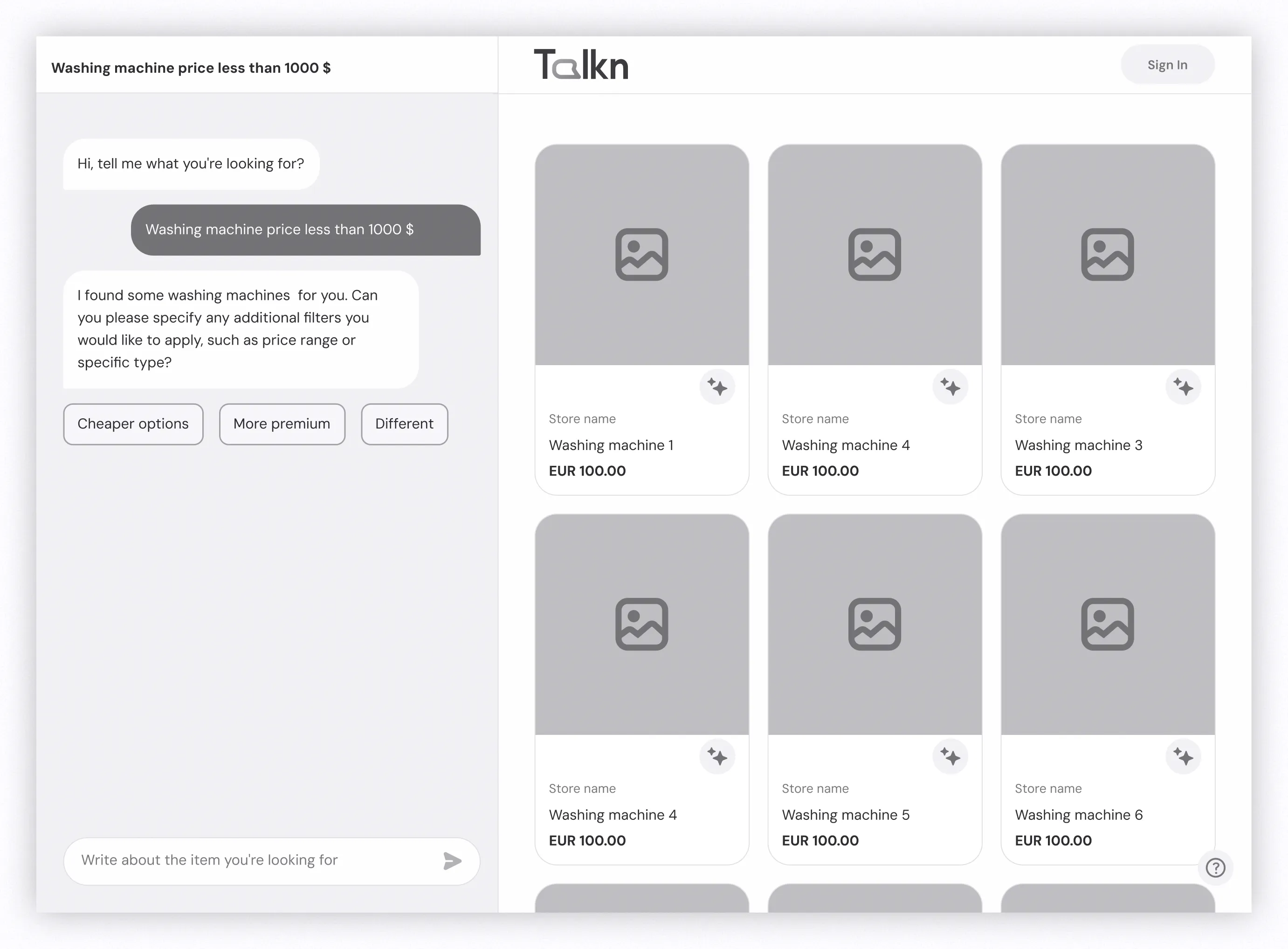
Design
The final design uses a layout with chat on the left and products on the right, combining guidance with a familiar browsing pattern.
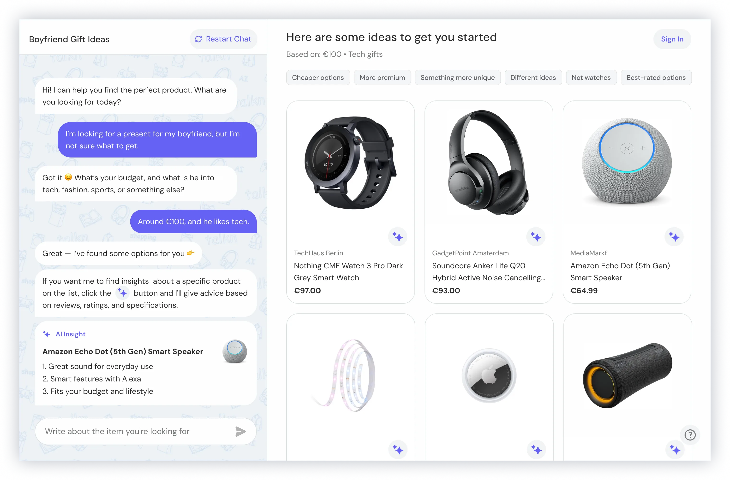
Outcome
Users can follow a clear flow, refine their preferences, and see how their input affects results in real time.
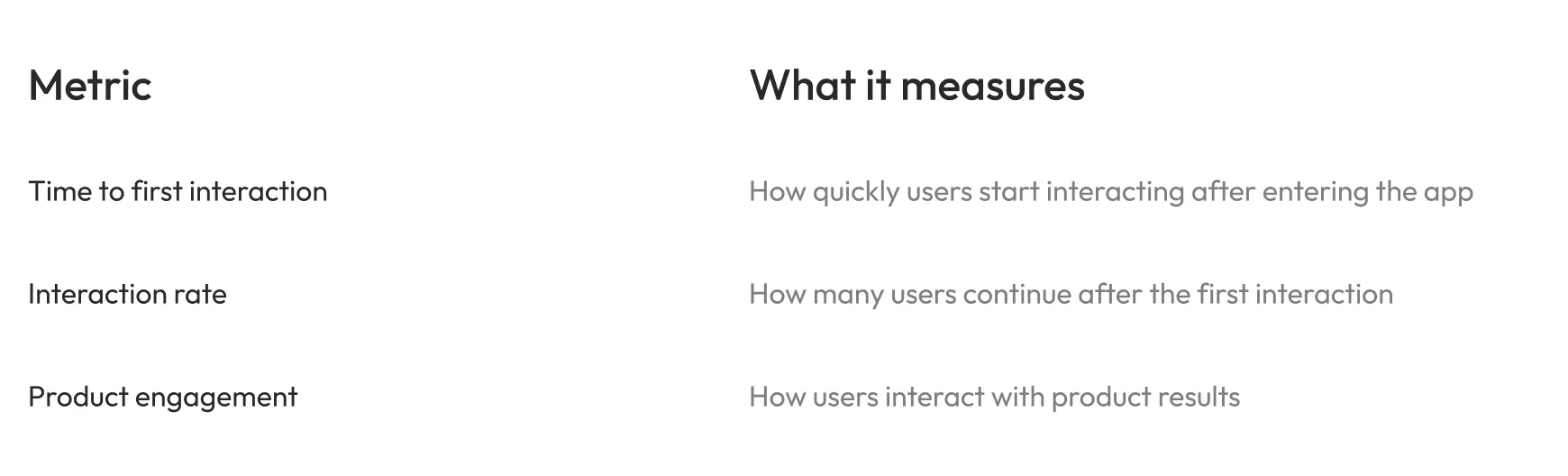
Success Metrics
What matters next
Since the product was in an early stage, these metrics can be used to track user behavior and engagement.
Outcome
Final outcome
The final solution addressed both key pain points by making it easier to start and creating a more structured interaction between chat and product results.
Users can now begin quickly, stay guided through the experience, and clearly understand how their input shapes the results.
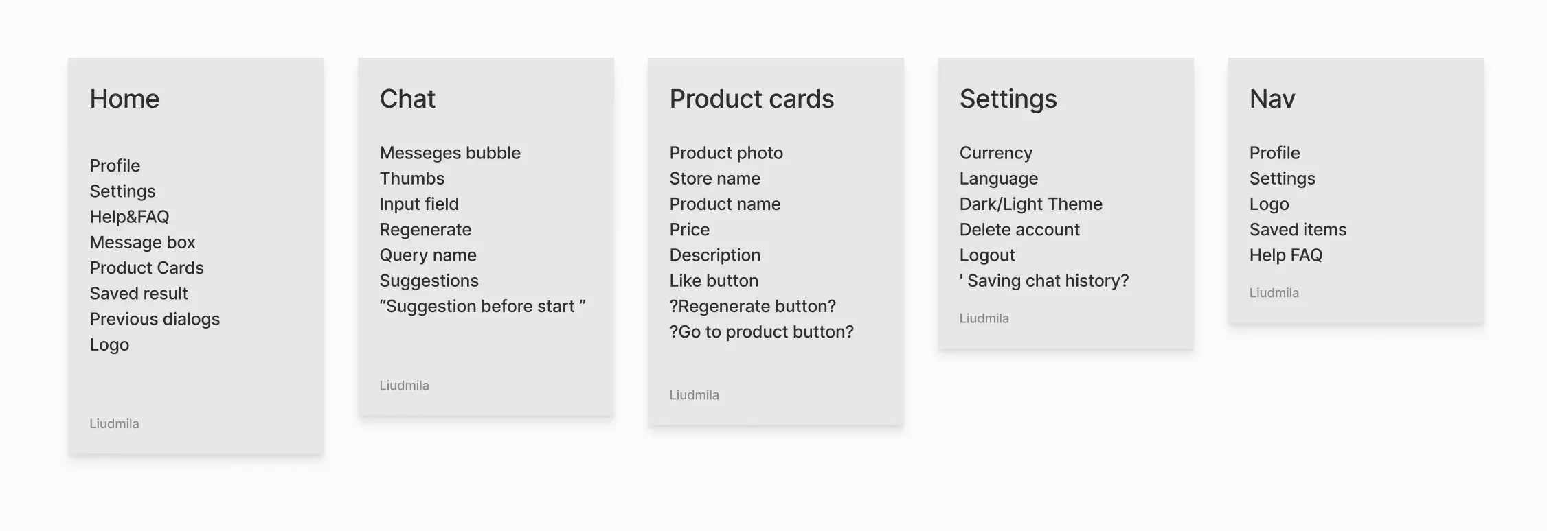
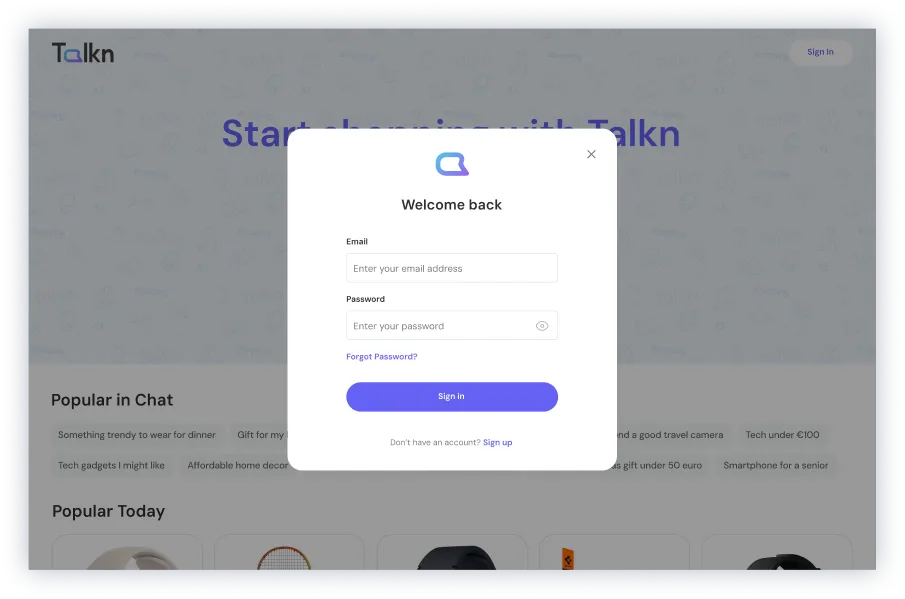
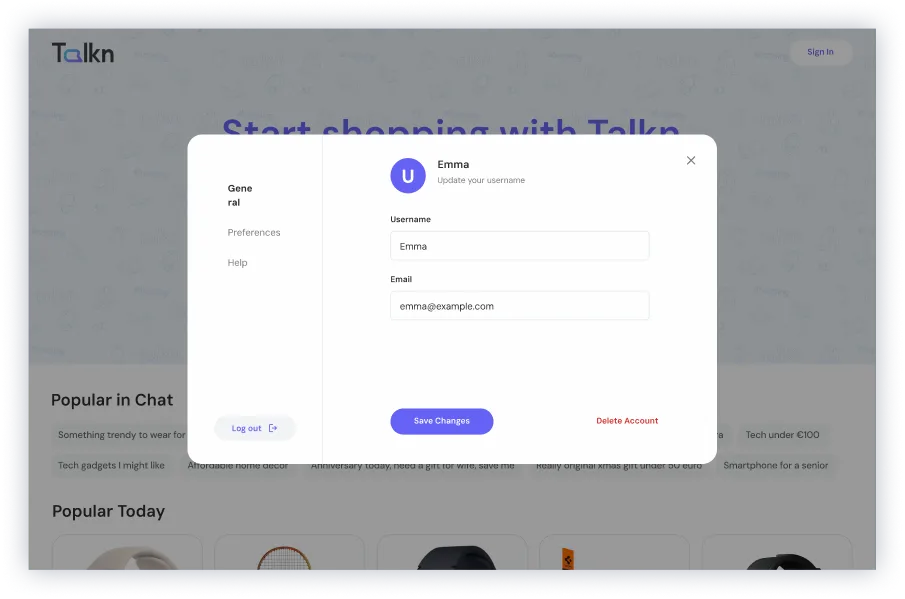
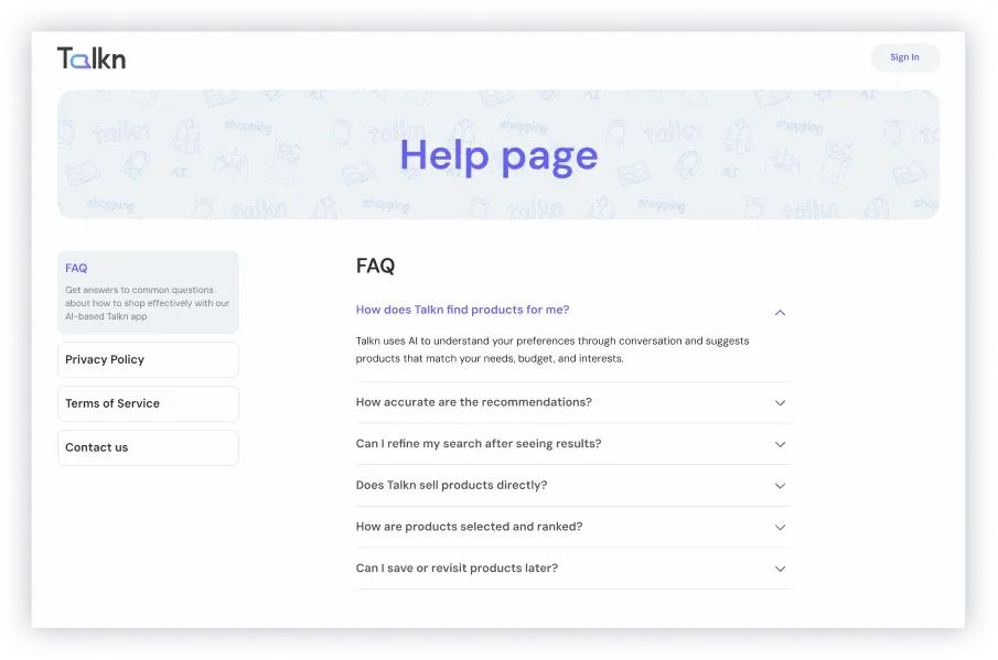
What was delivered
- Onboarding flow
- Starting experience with chat
- Main chat + product discovery experience
- Log in and sign up flow
- Profile experience
- AI Insights feature
- Empty and loading states
- UI Kit
- Branding and logo
- Landing page
Future considerations
We also explored features for future iterations:
- Saved items (shopping lists)
- Product comparison
- Search history
- "Search similar" functionality
Reflection
This project changed how I think about designing with AI.
AI is powerful, but without structure it creates confusion. Design is what makes it usable.