Overview
About
Consensium is a debate platform for experts on topics like AI, economics, and ethics. You stake points on the answer you believe in. Your vote carries more weight based on your expertise and how much you put on the line.
My role
I led UX and UI design on this project end-to-end — research, interaction design, prototyping, usability testing, UI, and the design system. The project ran through two distinct phases. In the second phase a product manager and a second product designer joined the team, and we worked side by side on the redesign.
I worked closely with the client, product owner, developers, and marketing throughout.
Act 1 — Gamified platform
The starting brief
The original vision was a gamified platform built around staking points on opinions — covering any complex, debatable topic: AI, economics, ethics, and more. The goal was something rewarding and engaging, closer to a prediction market than a forum.
The landscape
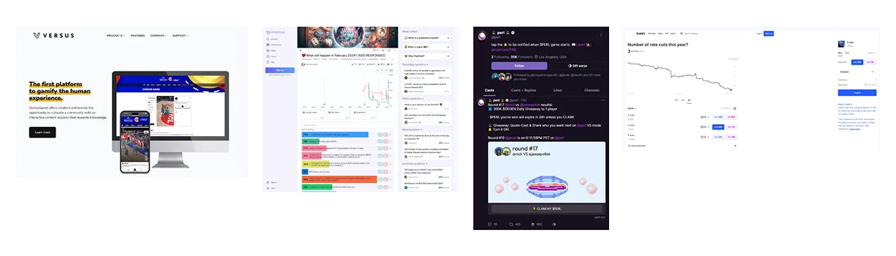
The space wasn't empty — it was broken. Prediction markets like Polymarket and Kalshi were intimidating to anyone outside finance. Debate tools were bland and confusing. Newer platforms were noisy and built for insiders. The gap was real: a place where backing your opinion felt natural, not overwhelming.
😕 Noisy
😕 Farcaster-native only
😕 Bland and confusing
😕 Intimidating
Who we were designing for
- Competitive strategy gamers
- Investment and trading enthusiasts
- Social media active users
- Predictive analytics hobbyists
- Pop culture enthusiasts and community leaders
Risks we named upfront
Three risks were on the table before any design work started. Empty City Syndrome: early users wouldn't find enough content to engage with. Sub-niche trap: too narrow an audience can't produce real consensus. Complexity: the staking mechanic had to be learnable fast — "complexity will kill" stayed in the conversation through both phases.
Design approach
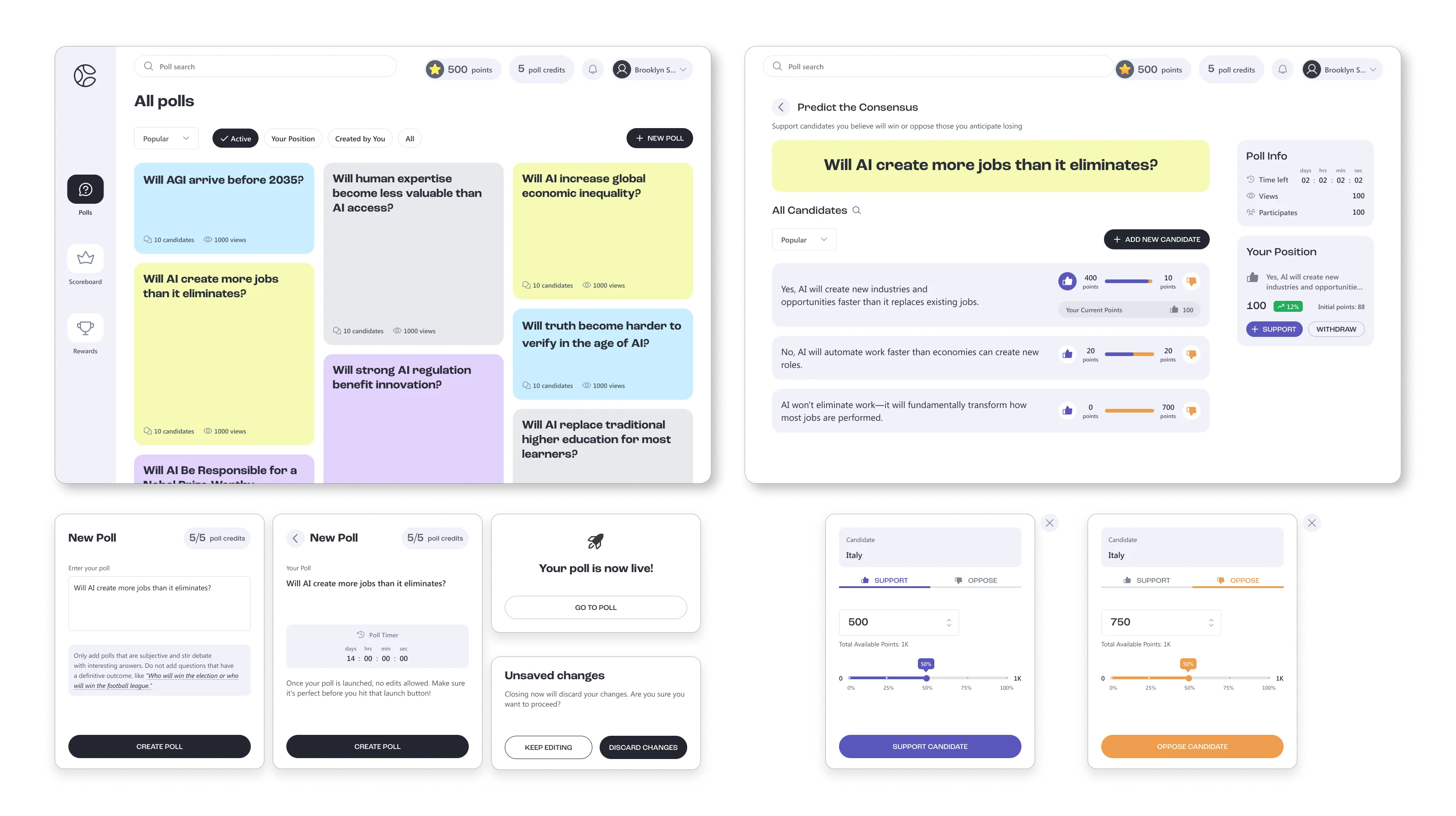
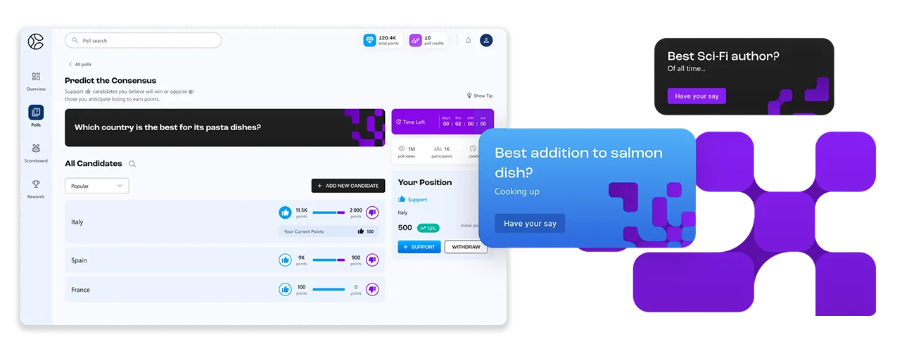
The client had an existing app flow to work from — the UX brief was to extend it, not reinvent it. The main challenge was the poll feed: how it felt to scan, how it communicated the staking mechanic, and whether it carried the right energy.
We explored a few directions and landed on something playful and colourful to reflect the gamified nature of the product, grounded in a clean white background to keep it breathable and approachable.
I led the visual direction and UI from there: defined the style, designed the core flows, and worked closely with engineering as we shipped.
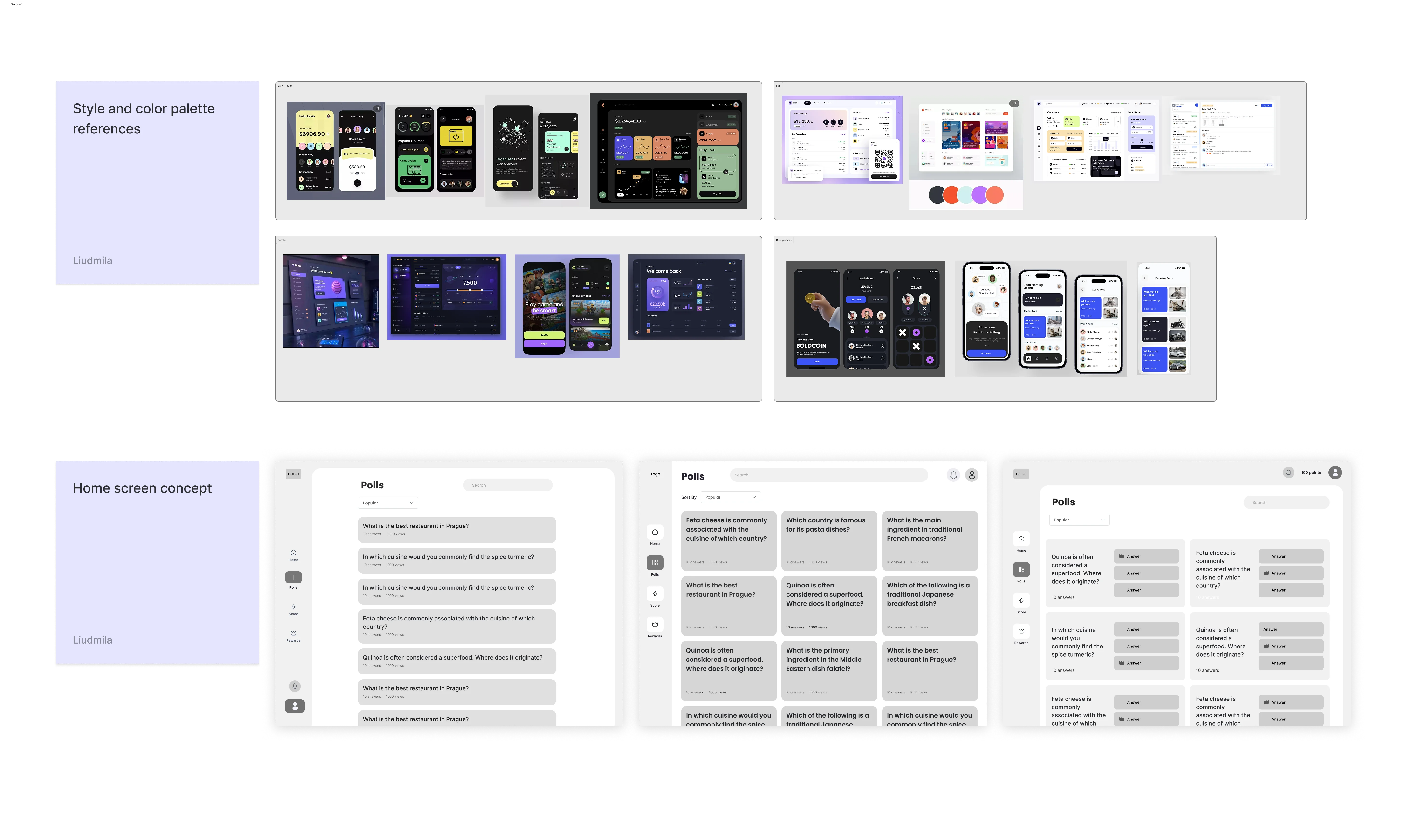
What we shipped in this phase
- Polls and Q&A creation
- Staking flow with active-bet tracking
- Profile with win/loss history
- Leaderboard
- Admin page for poll moderation
Mid-flight branding change
About two months in, an external agency was brought in to define the brand. We received a new logo, color palette, and typography — and rolled it across the existing product without slowing delivery. It was the first time the work had to flex around an external dependency, and it didn't derail the timeline.
The turning point
A new direction
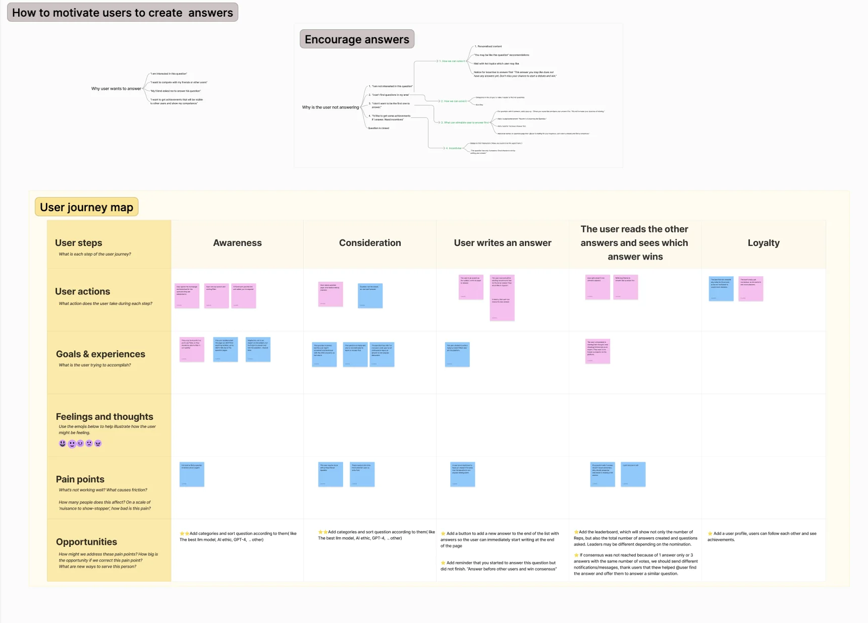
When a new product manager joined, he ran a session with the client and the team to step back and look at the product honestly. The conclusion was uncomfortable but clear: the platform felt too playful for the audience we actually wanted — domain experts who treat their reputation seriously. The reference shifted from prediction-market to "Reddit or Stack Overflow, but for thoughtful debate."

Validating with users
Before changing direction, we tested the existing prototype with 5 potential users. The signal was consistent: people could complete the flows, but the tone felt off for the kind of conversations they wanted to have. Staking specifically felt like a casino mechanic to them, not a credibility signal.
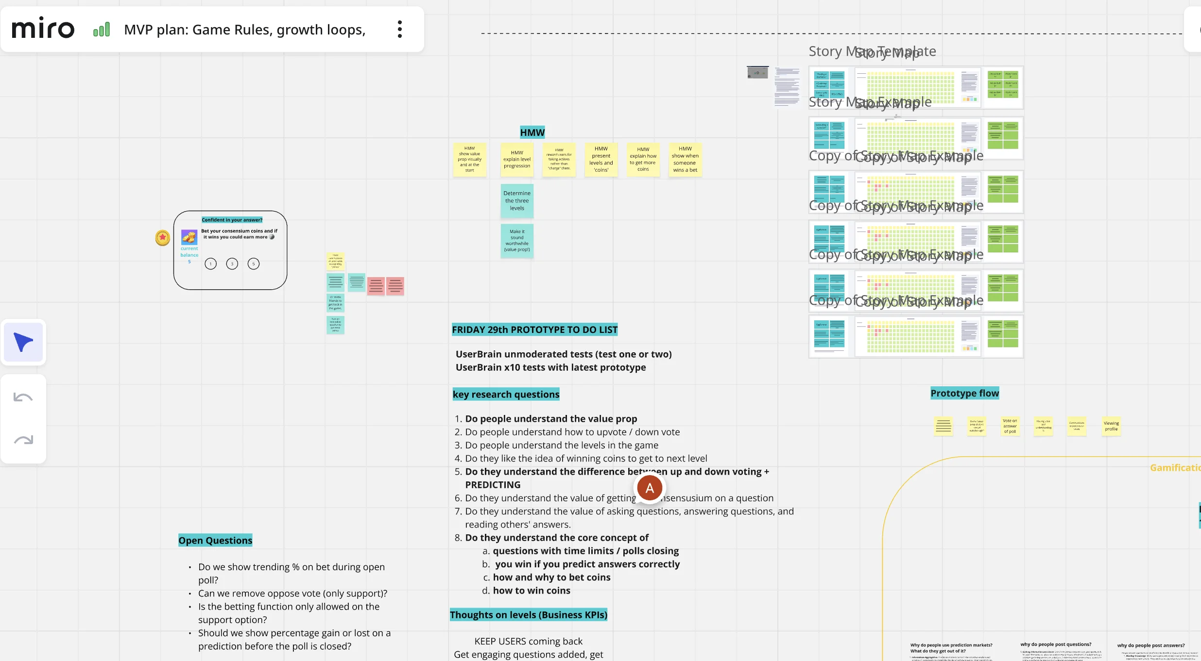
Design sprint
With direction confirmed, the second designer and I ran a sprint with the client, the new PM, and the engineering lead. We reframed the problem, mapped the user journey for the new audience, did Crazy Eights, and converged on a new interaction model where staking sits inside a discussion-first experience.
Outcome:
A new direction the whole team had a hand in shaping — which made the much-bigger redesign that followed possible without losing buy-in.
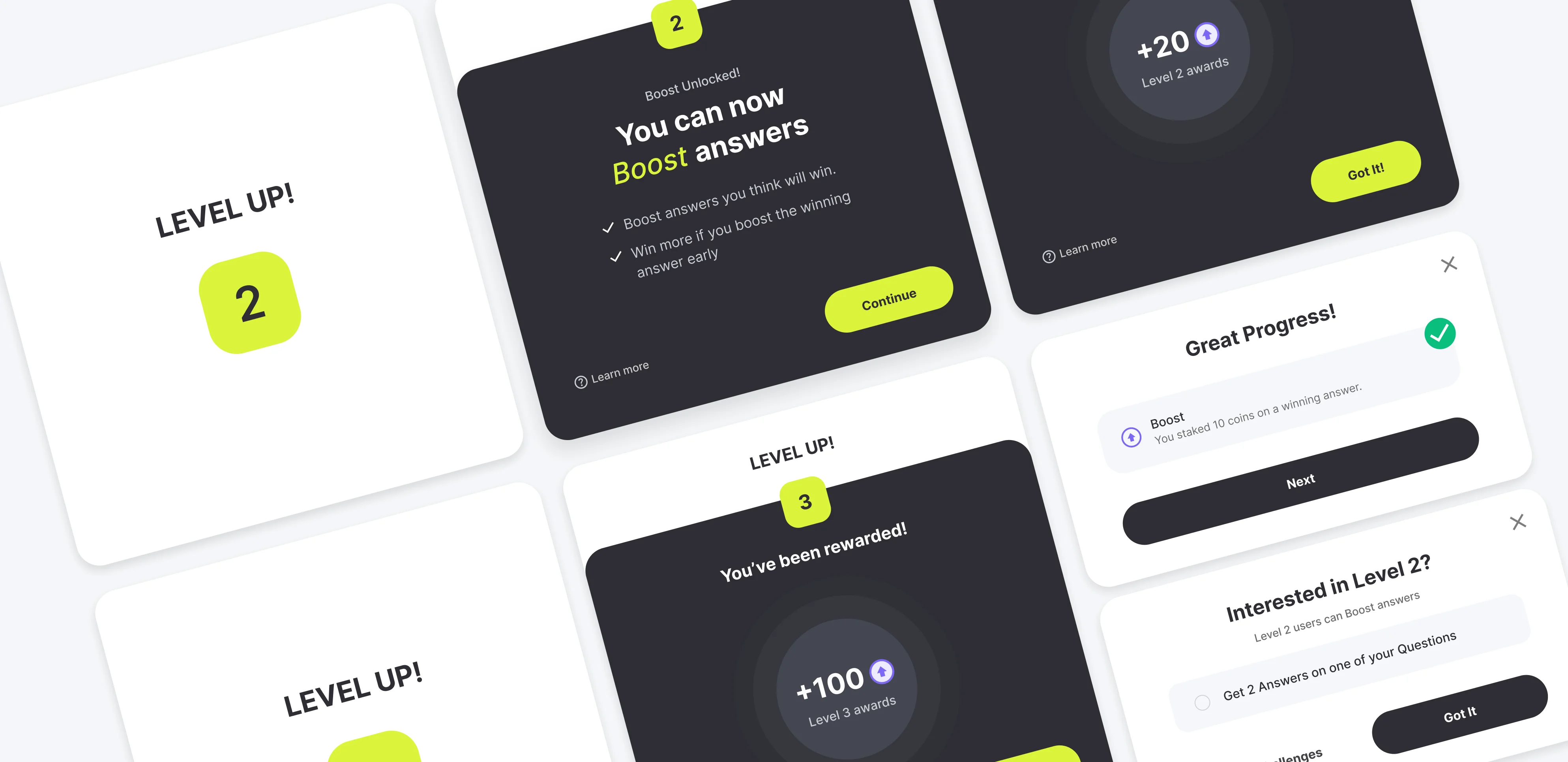
Feature unlocks
Profile view
We tried several ways to make staking feel natural, not forced. What worked: progressive disclosure — introducing the mechanic step by step as users engaged, rather than explaining it upfront. It felt earned, not taught.
Act 2 — A social platform for experts
The brief
The design sprint gave us a clear direction: build a social platform where people can discuss complex topics — not a debate tool, not a prediction market. A place where people engage with ideas and with each other.
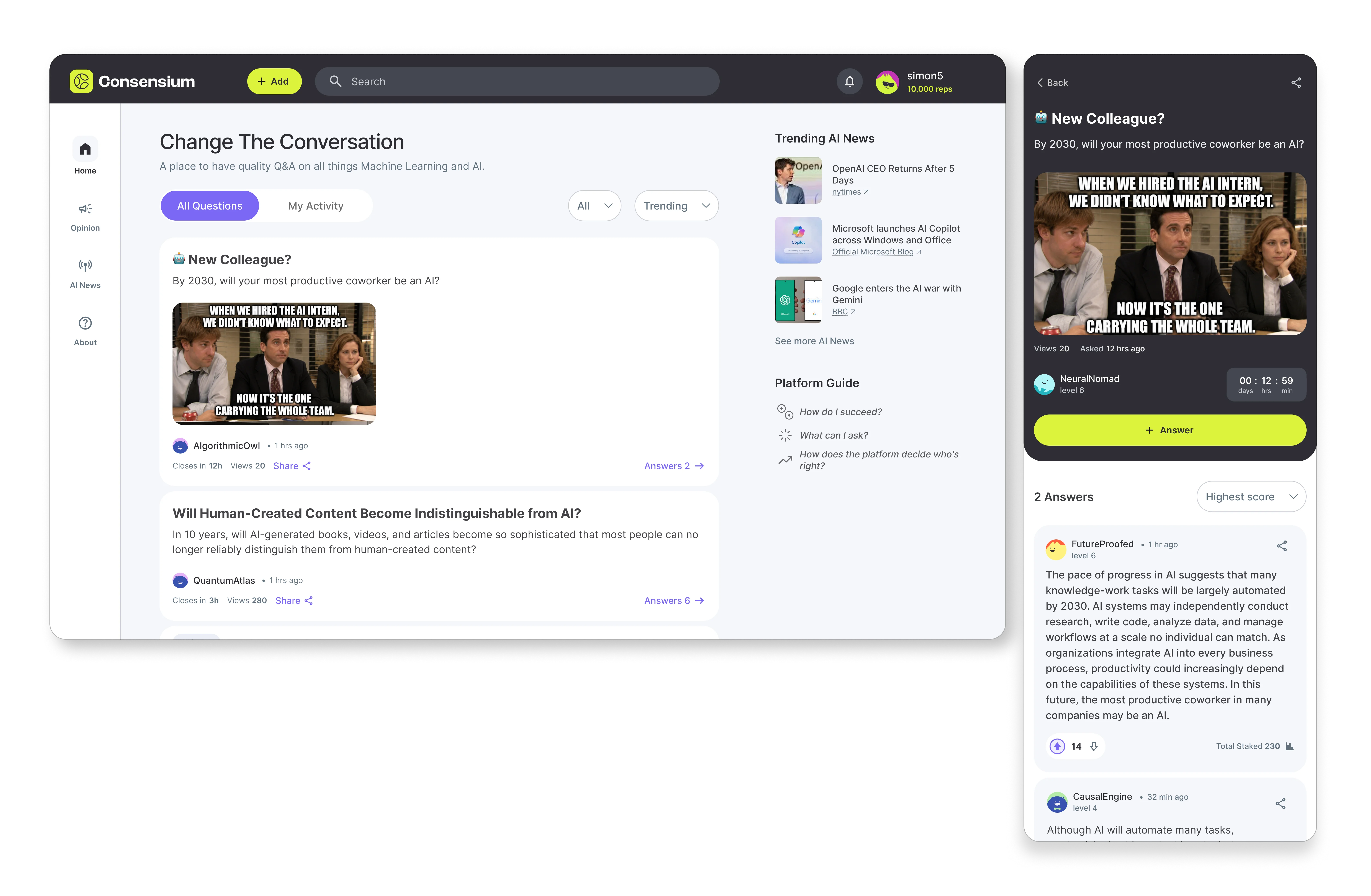
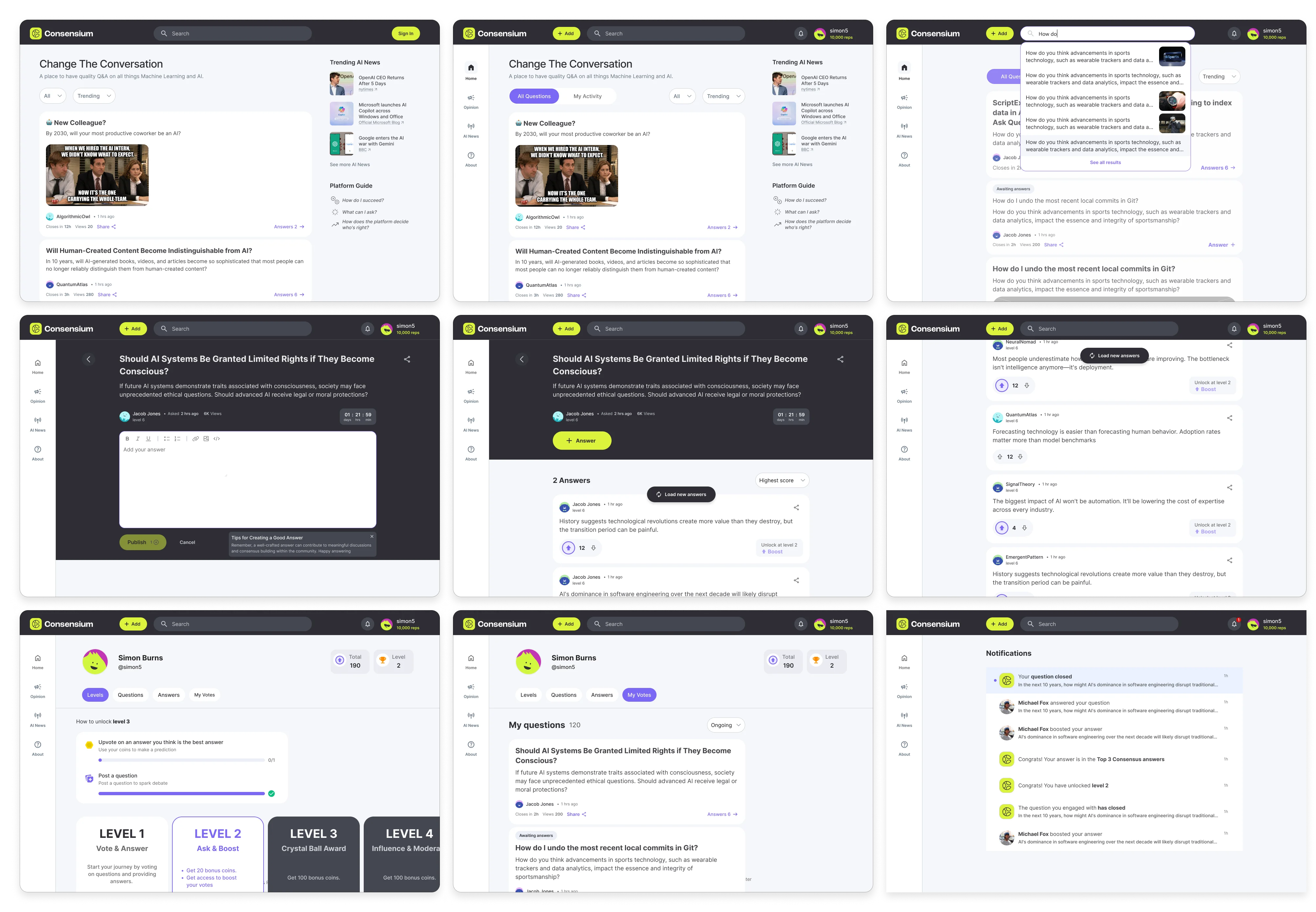
We started with the social essentials: profiles, points, and levels. The feed became scrollable and minimal — less noise, more content. One thing to read, one thing to do.
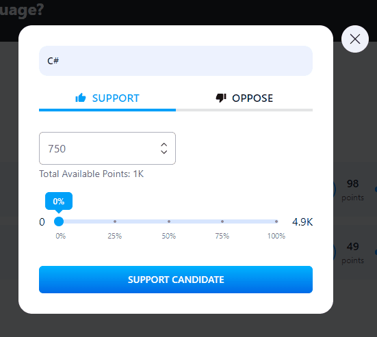
Rethinking how users stake
The staking mechanic was the core differentiator — but the experience around it felt foreign. "Stake" didn't land. Users understood voting, not staking.
The new flow
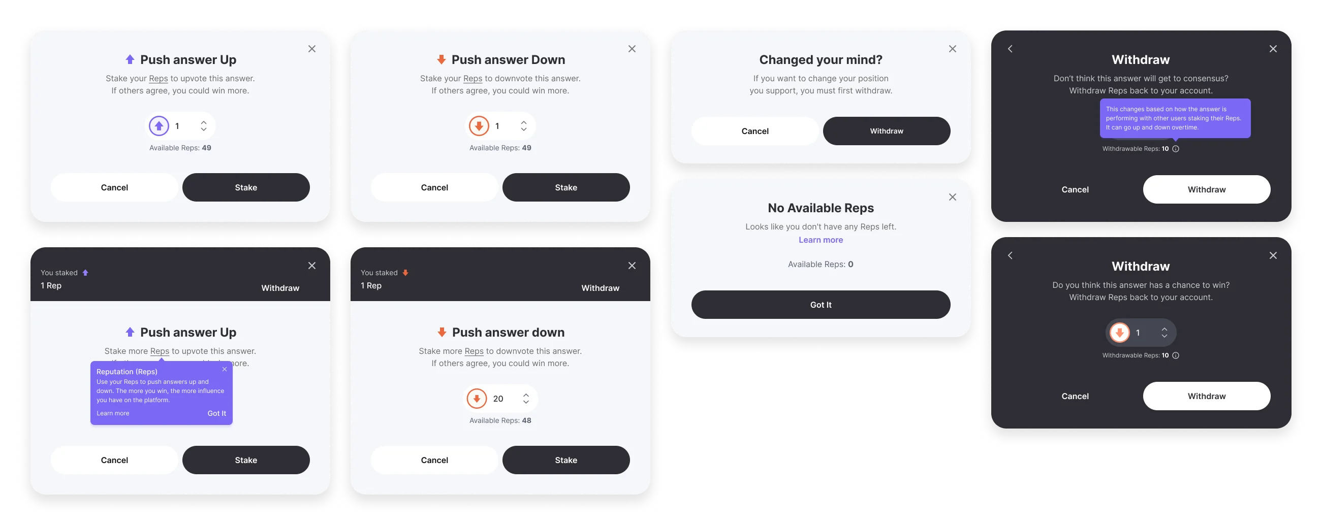
We reworked the whole flow: instead of staking, users push an answer up or down — and can withdraw their support at any time. Points earned became Reps — reputation that reflects how credible your contributions are over time. The mechanic stayed the same, but the language matched how people already think about content.
After testing with 10 users on UserBrain, they understood it without explanation.
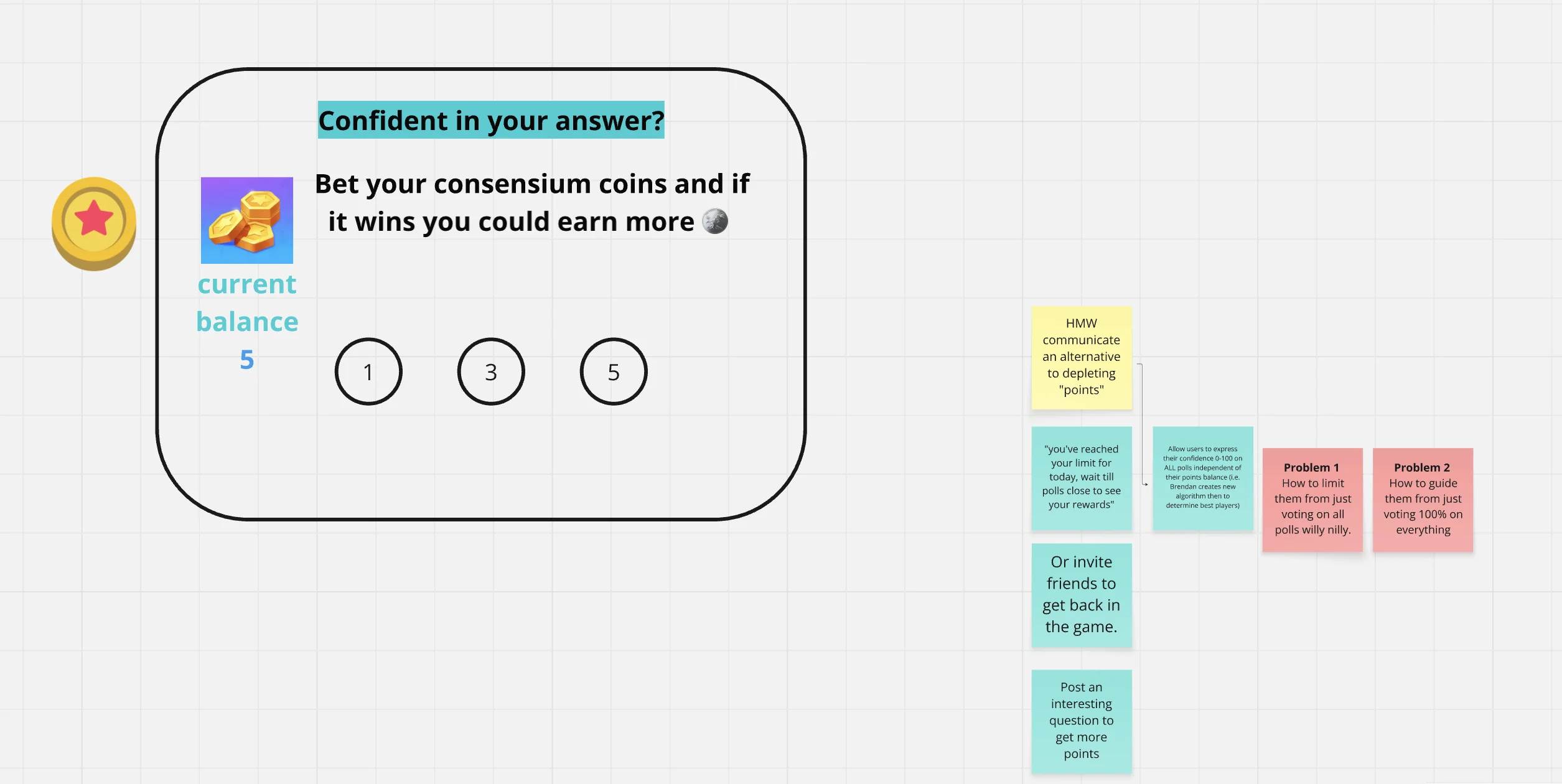
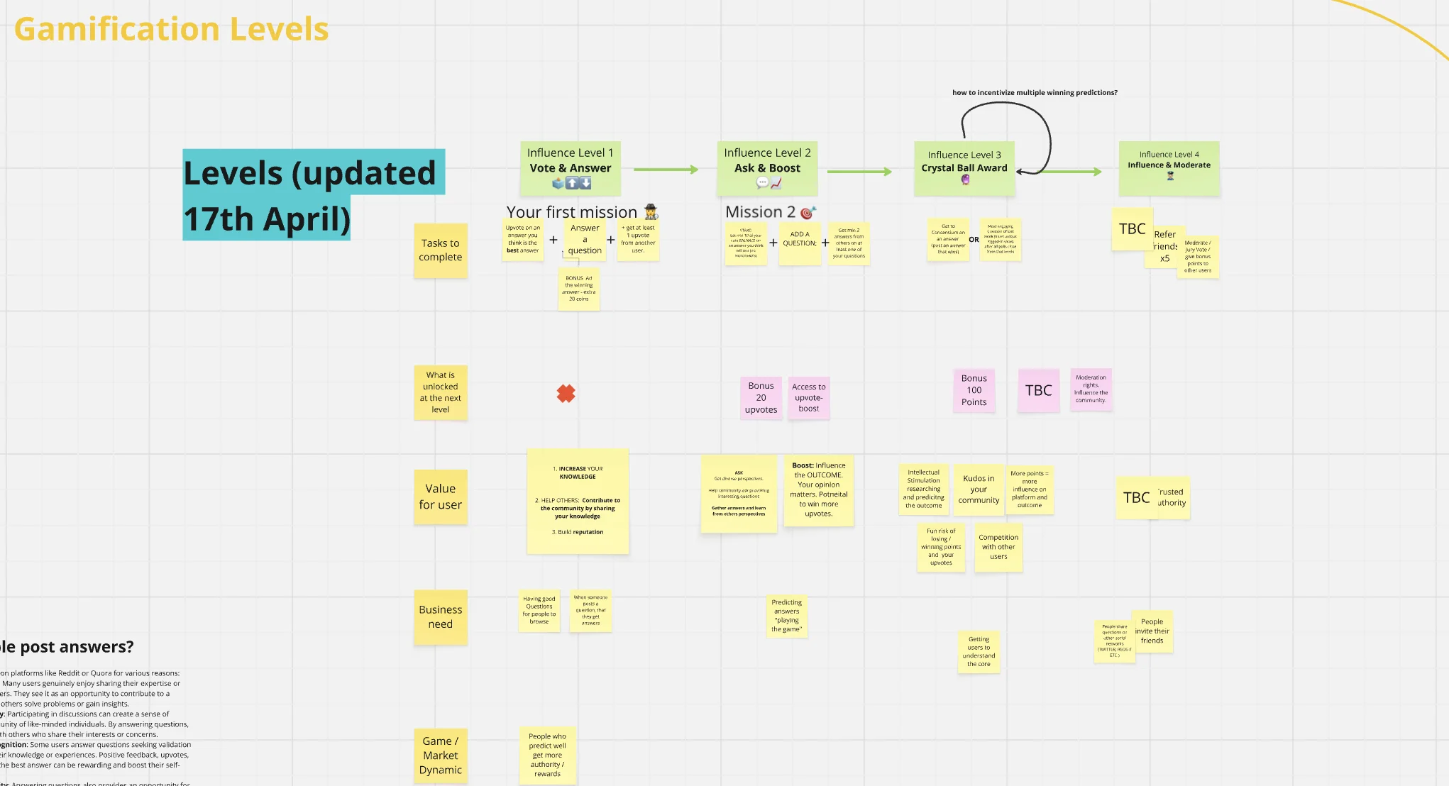
Levels brainstorm
In a brainstorm session on levels, a key decision emerged: staking shouldn't be available to first-time users. New users need to experience the discussion layer first — ask, answer, engage — before the credibility mechanic unlocks. This protected the quality of staking and gave new users a clear path in.
Scaling the experience
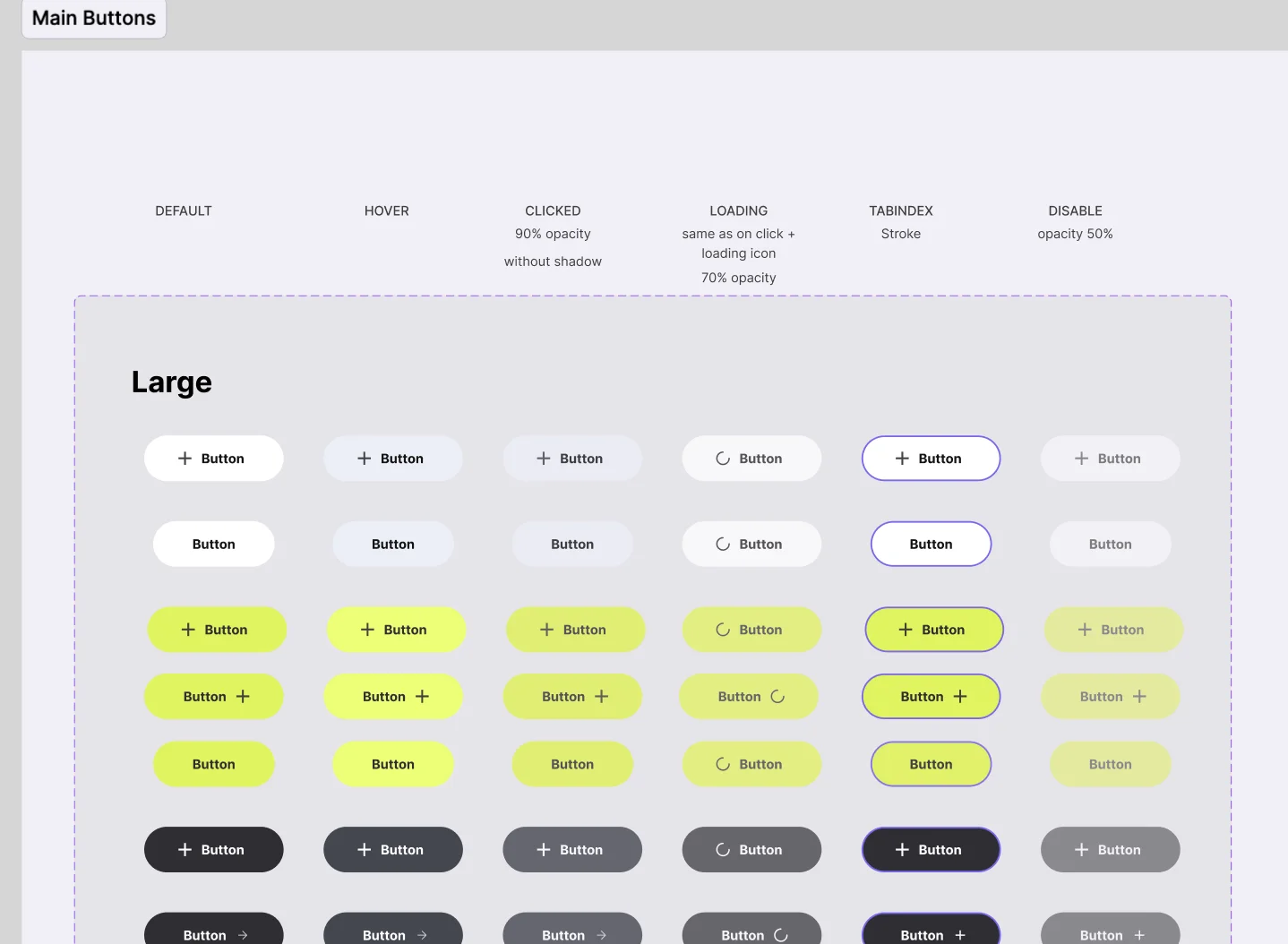
Design system
Once flows stabilized, I rebuilt the design system in Figma on top of Tailwind tokens so it mapped 1:1 to what engineering shipped. Components stayed in sync as the product grew.
Outcome:
A consistent component library that kept design and development aligned through a fast-moving Act 2.
Onboarding
Onboarding was one of the most iterated parts of the project. We tested several approaches with different goals — prompting users to ask a question, prompting them to answer one, a general walkthrough with platform rules, and one with example questions.
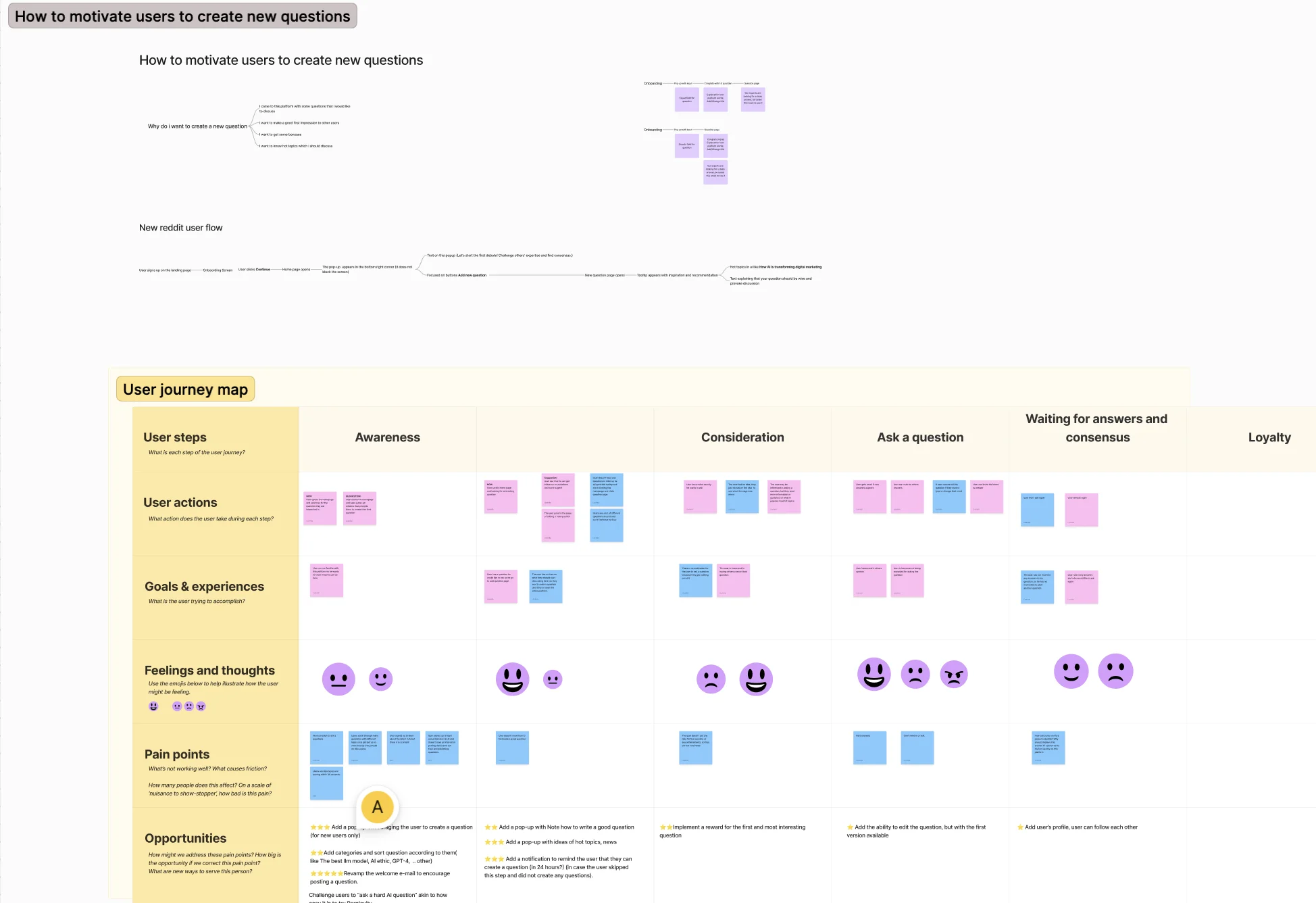
Testing different onboarding approaches gave us something beyond better flows — it generated real user content early. Questions and answers posted during testing made the platform feel active and alive from day one, which helped new users trust the product faster.
Outcome:
Real content from onboarding testing made the platform feel alive before launch.
Landing pages
To support different acquisition channels, I designed five landing pages: a general marketing page, a business-facing page, a hackathon page, and two variants for paid campaigns.
And more...
There's a lot we did that I didn't cover here, not because it wasn't important.
- Jury system: when upvotes and downvotes tie, real users decide which answer wins — and we designed how to reward them for it
- Admin page (separate from Jury): for people who keep the platform's atmosphere in check
- Opinions page: where experts post takes on hot topics to spark real debates
- Email: tested carefully what to send, when, and how to keep users in the loop without annoying them
- Win/Lose flow: the moment you find out how consensus landed on your question or answer
- Marketing materials: Reddit posts, hackathon ads, paid campaigns
We had a lot of ideas. In some sprints I shipped an epic a day to keep up with delivery. Learned more than I expected on this one. Grateful for it.
Reflection
Consensium was the kind of project that stays with you.
We worked with people from different countries on an idea that genuinely mattered: building a space where quality thinking rises above noise. Looking at what's happening in tech today, that problem feels more relevant than ever.
Not every great startup finds its moment. Consensium didn't make it to the finish line — and that's okay, that's part of the story. But the research, the decisions, the things we built and rebuilt — it was real work on a real idea, and it deserved more than a footnote.
Grateful for the team and for everything it taught me.